Choosing the right color scheme

To begin with, many thanks go to Laura Owens of Renewed Spaces for providing this post. This kind of expertise is out of my universe. However, it is valuable for someone who has just purchased a home and is looking for decorating ideas.
Having a hard time picking a color scheme? Look around. Anything can act as a color and design inspiration for your room. A favorite paining (to the right), photo, note card, piece of pottery, a textile or piece of clothing can provide the color pallet for your room. Anything that captures your attention and that you connect with on some visceral level can be your inspiration.
Putting it all together
From your inspiration piece select two main colors, an accent and a neutral color for your pallet. If your inspiration piece only has two colors, then use variations of those colors and choose a neutral such as white, cream, tan, brown, grey or black to use with them. Using  lighter and darker variations of the colors in your room will add life and pizzazz. If all the colors are the same shade and tone, the room can become stagnate and stiff feeling. Notice in the picture to the left, that you can use the colors you choose in a bold, vibrant way or in a soft subtle manner. Think about how you want the room to feel, how you want to feel when you’re in the room, what mood or emotions you want to evoke and then choose accordingly.
An example of a color scheme pulled from the painting above is shades of blues and greens with brown as the neutral and yellow or orange as the accent. You can also use blue and yellow as your primary colors with green as the accent. The accent color is used the least in a room but should be spread through the space in at least three different areas. It will be the color that adds “pop” and drama. In either scenario, brown(or tan) is the neutral. The neutral is used most often as 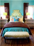 flooring, wall color or in the largest furniture pieces in the room. By keeping your main (and usually most expensive) pieces, such as the sofa, neutral, it will allow you to change the look, feel and colors of a room by simply changing out the accessories and artwork. For example, in the picture of the living room, the sofa is the neutral with the throw pillows, accessories and artwork in blues and greens. It will be an inexpensive and easy change to switich up the room for the fall season by simply switching out the blue pillows, accessories and artwork for orange and golden toned ones that will warm up the green in the room. In the bedroom picture to the right, the throw on the bed and the curtain panels can be switched out to crisp white or a green and orange pring on a white background for an airy summer look. Just with some simple and usually very affordable changes the room will take on a completely different attitude.

If you would like to contact Laura Owens at Renewed Spaces for help with decorating ideas, she can be contacted at (480) 593-3965. Her website is: www.renewedspacesdesign.com